


Two-column layouts are pretty useful, especially if you want to place two elements side by side on your web page. To do this, you'll want to create one parent element and two child ones.
Using two divs as a quick example, you could create something like so:
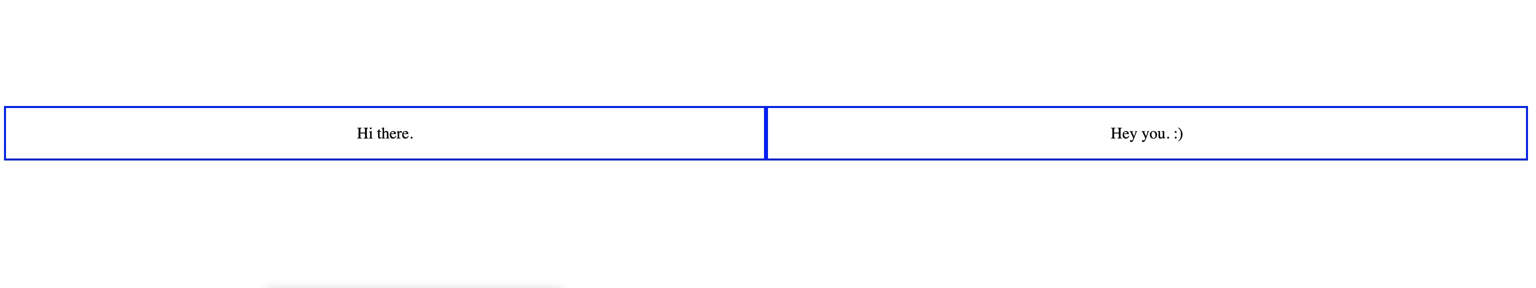
<div class="row">
      <div class="column">
           <p>Hi there.</p>
      </div>

      <div class="column">
           <p>Hey you. :)</p>
      </div>
</div>
Once you have this, you'll then add some styling to these elements using their classes. I've added some border colors to differentiate the boxes, but to get this layout, you'll add this style, "display: flex" to the parent div and "flex: 50%" to the child div like so:
.row {
  display: flex;
}

.column {
  flex: 50%;
  border: 2px solid blue;
  text-align: center;
}
The end result will be two columns sitting side-by-side like this:
You'll find the demo piece of code here on CodePen here.
Thank you for reading! I'm over at @tbrmonster on Twitter if you want to follow my coding journey or just talk about JavaScript things. :)